
You look up one keyword, and the tools disagree. One shows a few hundred searches a month, another a few thousand; a third marks it "low volume" while Google Trends shows a clear seasonal spike. None of them is necessarily broken. They measure different things in different ways, and the job is not to find the "true" number but to decide, with a defensible method, whether the demand is real and worth pursuing. This page is a cross-checking procedure for exactly that situation.
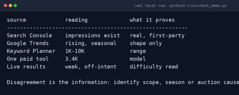
#!/usr/bin/env python3
# Illustrative fixture: line the demand sources up instead of averaging them.
# Values are a hand-made teaching example, NOT Google data.
sources = [
    ("Search Console", "impressions exist", "real, first-party"),
    ("Google Trends",  "rising, seasonal", "shape only"),
    ("Keyword Planner","1K-10K",           "range"),
    ("One paid tool",  "3.4K",             "model"),
    ("Live results",   "weak, off-intent", "difficulty read"),
]
print(f'{"source":<18}{"reading":<20}{"what it proves":<18}')
print("-"*56)
for s,r,w in sources:
    print(f'{s:<18}{r:<20}{w:<18}')
Why the numbers disagree in the first place
- Advertising estimates versus behavioural panels. Keyword Planner is built on Google Ads data, which is shaped by advertising and aggregated. Third-party tools often blend a clickstream panel with modelling. Different inputs produce different outputs.
- What a "keyword" includes. Some tools group close variants and near-plurals; others separate them. The same string can therefore cover a narrow or a broad set of real searches.
- Match type and geography. In Keyword Planner, broad, phrase and exact match return different figures. Country, language and season all move the result.
- Estimates, not counts. Outside an active Ads account, Keyword Planner shows ranges. Third-party volumes are models. A precise-looking number can still carry a large error band.
This is why "the volume is X" is the wrong mental model. The right model is "the sources agree the term is roughly in band Y, and here is why".
The official reason two keywords can share one volume number
Before blaming a tool, know that Google itself aggregates. Keyword Planner's own column definition says the figure is the average number of searches for a keyword and its close variants for the selected month range, location and network (Google Ads Help). So if two phrasings you consider different show an identical value, they may simply have been grouped. The same concept exists in the API: Generate historical metrics returns a "close variants" list for each keyword you submit.
| What you see | Most likely cause | First check |
|---|---|---|
| Two phrasings show the identical number | Google grouped them as close variants | Look for the variant list, not two separate rows |
| One tool says hundreds, another thousands | Different data sources and modelling | Confirm country, language and variant handling match |
| Planner shows a range, a tool shows a single number | Planner buckets ranges; the tool models a point estimate | Compare bands, not decimals |
| A term you target has no Planner data | Very low volume, or a sensitive category | Do not read it as zero demand |
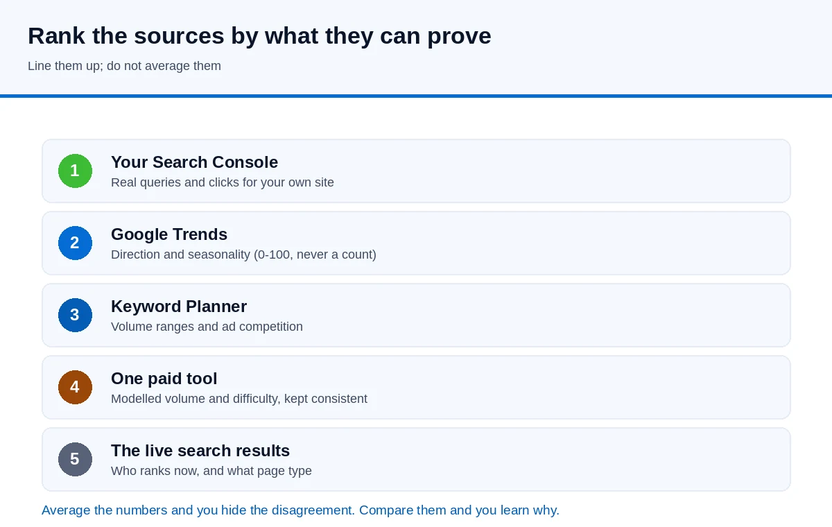
Rank your sources by what they can actually prove
| Source | What it tells you | How much to trust it |
|---|---|---|
| Google Search Console (your property) | Real queries you already appear for, with impressions, clicks and average position | Ground truth for your site; but only for terms you already surface for |
| Google Trends | Relative interest on a 0–100 scale, seasonality, direction of change | Reliable for shape and comparison; never a count |
| Google Keyword Planner | Volume ranges, competition and bid ranges from advertising | Good for relative comparison and the paid side; ranges until you spend |
| A third-party keyword tool | Estimated volume, difficulty score, clustering, competitor gaps | A model. Useful for coverage and consistency; not a measurement |
| The live search results | Who currently ranks and what kind of page they are | The most direct evidence of how hard the term is to win organically |
The cross-check: make the numbers disagree out loud
The method below deliberately places the sources side by side instead of averaging them, because averaging hides disagreement rather than resolving it.
- Start from your own demand. Export the relevant queries from Search Console. If the term already gets impressions for you, you have a floor of real evidence. If it never appears, that is not proof of no demand — it only means you are not visible for it yet.
- Get the shape from Trends. Put the shortlist into Trends and compare the terms against each other over several years. Record whether interest is rising, flat or seasonal, and note the peak month. Trends answers when and whether, not how many.
- Get a band from Keyword Planner. Record the range, not a single figure, and note the match type and country. Ranges that overlap between two terms mean you cannot rank them by volume with confidence.
- Add one third-party tool and keep it consistent. Use the same tool for every term in the comparison so its bias is constant. Do not mix scores across vendors; difficulty numbers are not comparable between them.
- Read the actual results. For the two or three terms that survive, look at the top results. Are they the page type you would write? A term with modest reported volume and weak, off-intent results can be a better target than a "big" term owned by authoritative pages that already answer it perfectly.
- State a confidence, not a number. If all sources point the same way, treat the demand as confirmed. If they disagree by an order of magnitude, treat it as unknown and either gather more evidence (a small test page, a paid experiment) or move on.
An illustrative reconciliation (method only, not measurements)
The table below shows the shape of the output, with relative bands rather than invented precise counts. Replace the bands with whatever your own tools report; the point is the pattern of agreement.
| Term | Trends direction | Planner band | Third-party band | Results intent | Decision |
|---|---|---|---|---|---|
| Term A | Rising, seasonal | Medium | Medium | Matched, but weak pages | Proceed; schedule before the peak |
| Term B | Flat | Low | High | Mixed, commercial | Investigate the gap before writing |
| Term C | Falling | High | High | Strong, well-answered | Low priority despite the volume |
Term B is the interesting one: two sources disagree, so the honest answer is "unknown" until you look at why. That may be a variant-grouping difference, a geography difference, or a seasonal term measured in different windows.
Turning disagreement into a checkable question
- Is the difference in scope? Confirm both tools are measuring the same country, language and variant grouping.
- Is it seasonal? Compare the same months, not a peak year against a trough year.
- Is it the ad auction rather than demand? A high CPC means advertisers compete, not that the term is easy to rank for.
- Is the term worth the effort even at the low end? If the smaller estimate still covers a valuable, convertible query, the disagreement does not change the decision.
Where this fits next
Cross-checking tells you which terms deserve attention. To see how the individual data types differ, read the four questions keyword tools answer. For reading the Trends side properly, see how to read Google Trends. And if you want to pull Trends data into your own pipeline rather than the website, the three ways to get Trends data compares the official API, the CSV export and the private endpoints. Guangsuan turns this kind of evidence into a content and technical plan through its Google SEO service.
Sources
- Google Ads Help — Use Keyword Planner
- Google Ads API — Generate historical metrics
- Google Trends
- Google Search Console
- Google Search Central — Creating helpful, reliable, people-first content
Volume figures from every tool are estimates, and the bands above are deliberately relative rather than invented counts. Verify the current pricing and behaviour of any tool on its own site.